
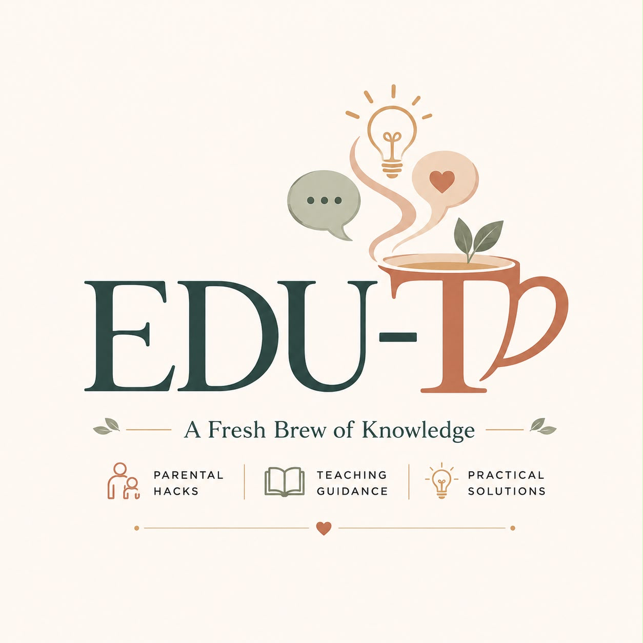
EduTea sealEduTea lockup

The EduTea Brand Book

A Fresh Brew of Knowledge — the complete visual and verbal identity system for EduTea, from logo and colour to voice and real-world applications.

01 — Brand Story

Knowledge, brewed with care.

EduTea's story is told through five small symbols. Each one carries part of what the brand believes about learning.

Tea Cup

Knowledge Shared

The vessel that carries something warm from one person to another.

Leaves

Growth

What steeps and unfurls over time, given the right conditions.

Lightbulb

Understanding

The moment a difficult idea finally makes sense.

Conversation

Connection

Knowledge that only matters once it is shared out loud.

Heart

Care

The reason EduTea exists — for real families, real classrooms.

The Formula

Knowledge × Conversation × Care × Growth

Every EduTea touchpoint should register on all four — otherwise it isn't finished.

02 — Brand Purpose

Why EduTea exists

Purpose keeps the brand honest as it grows — it's the test every decision should pass.

Mission

To share simple, practical and relatable tips and hacks that make everyday education easier — from classroom ideas and parenting tips to student support and leadership advice, without the complicated jargon.

Vision

To make the education journey easier, one tip, one hack and one conversation at a time — the go-to space for parents, educators, students and anyone just starting out.

Practical over theoretical

No complicated theory and no one-size-fits-all rules — just what actually works.

Like a friend, not a textbook

EduTea speaks the way you'd speak over tea: honest, warm, jargon-free.

Respect for time

Short, focused lessons that fit into real, busy lives.

Care in every detail

From colour to copy, the brand should feel considered and calm.

04 — Logo Meaning

What's built into the mark

Every element of the EduTea seal traces back to the brand story.

Tea Cup

Knowledge Shared

Leaves

Growth

Lightbulb

Understanding

Conversation

Connection

Heart

Care

05 — Logo Variations

A mark for every context

EduTea primary lockup

Primary Logo

EduTea sealEduTea

Secondary Logo (Seal + Wordmark)

EduTea circular seal

Circular Seal

EduTea app icon

App Icon

EduTea seal in monochrome

Monochrome

EduTea logo reversed on dark

Reverse (On Dark)

06 — Clear Space

Let the mark breathe

Maintain a minimum clear space equal to the height of the seal's leaf on every side. Never let text, imagery or edges intrude.

XXXXEduTea seal with clear space illustration

07 — Minimum Size

Never smaller than this

Below these sizes the mark loses legibility and detail. For favicons, use the simplified app icon form.

Seal at 24px minimum digital size

24px — digital minimum

Seal at 40px comfortable size

40px — comfortable UI size

Lockup at 20mm print minimum

20mm — print minimum width

08 — Incorrect Usage

Protecting the mark

These live examples show common mistakes. When in doubt, use the primary lockup on a plain cream or warm-white background.

DoCorrect EduTea logo usage

Proportional, high contrast, clear space respected

Don't
Stretched EduTea logo, incorrect usage example

Don't stretch or distort

Don't
EduTea seal recoloured off-brand, incorrect usage example

Don't recolour off-brand

Don't
Rotated EduTea logo, incorrect usage example

Don't rotate the mark

Don't
EduTea logo on low contrast background, incorrect usage example

Don't use on low-contrast backgrounds

Don't
EduTea logo over cluttered background, incorrect usage example

Don't place over cluttered imagery

09 — Colors

A warm, editorial palette

Forest and terracotta carry the brand's voice; cream and warm white keep it calm and legible. Click any tile to copy its hex code.

#29463CRGB 41, 70, 60

Primary brand, headings on light, key surfaces

#C87552RGB 200, 117, 82

Accents, highlights, primary calls to action

#939B82RGB 147, 155, 130

Secondary text, dividers, quiet UI

#D6A15FRGB 214, 161, 95

Small highlights, badges, illustration detail

#FBF7F0RGB 251, 247, 240

Application background, the dominant surface

#FFFDF9RGB 255, 253, 249

Cards, sheets, elevated surfaces

#29312ERGB 41, 49, 46

Body copy, UI text, icons

Usage Ratio — 55 / 20 / 10 / 10 / 5

Cream / Warm White — 55%
Forest — 20%
Sage — 10%
Terracotta — 10%
Sand — 5%

Contrast guidance: pair Forest or Charcoal text on Cream/Warm White for body copy (AA+ contrast). Terracotta and Sand are for accents and small UI, not long text passages. Reverse text (Cream on Forest) is safe for headlines and buttons.

10 — Typography

Editorial serif, calm sans

Playfair Display carries emotion and authority in headlines. Inter handles UI, body copy and numerals with clarity.

Display / Playfair Display

A Fresh Brew of Knowledge

One tip, one hack, one conversation at a time.

Course Titles

Dealing With Tantrums Without Shouting

The New Teacher Survival Guide

Body Copy / Inter

Practical responses for the moments that feel impossible — five focused lessons you can apply the same day.

Buttons / UI

Start CoursePreview LessonAED 79

Numerals

01 02 03 — AED 79.00

4.8 rating · 1,204 learners · 45 min

Bilingual Architecture — Arabic Readiness

Typography is built RTL-ready: layouts use logical spacing (start/end, not left/right), Playfair Display pairs with a matching Arabic display face for headlines, and Inter pairs with a clean Arabic UI face for body and interface text. Type scale, line-height and weight ratios stay consistent across both scripts so the two languages feel like one unified system, not a translation bolted on.

المعرفة، مُخمّرة بعناية.

11 — Icons

Line icons, one weight

A single-weight (1.75px) line icon set keeps the interface calm. Icons live inside soft, tinted circles — never as loud, filled shapes.

12 — Photography Direction

Warm, natural, real

Photography favours soft daylight, honest expressions and real settings — homes and classrooms, not stock-photo studios. Colour grade leans warm and slightly desaturated to sit inside the palette.

EduTea photography direction example
  • • Natural light, minimal flash
  • • Real parents, teachers and children — not posed stock
  • • Warm, slightly desaturated grade
  • • Close, intimate framing over wide studio shots

13 — Illustrations

Simple line-and-wash

Where photography can't reach — onboarding, empty states — illustrations use single-line linework with a soft terracotta or sage wash, echoing the leaf motif in the logo.

Leaf motif

Cup + steam

Speech + heart

14 — Patterns

Quiet background texture

A repeating leaf-dot motif, used at low opacity, brings texture to section dividers and cover pages without competing with content.

15 — Tone of Voice

Warm, plain, never clinical

EduTea sounds like a trusted mentor — clear, kind, and specific about real moments. Avoid jargon, corporate distance and empty enthusiasm.

SituationDon'tDo
Introducing a courseOur comprehensive curriculum leverages evidence-based pedagogical frameworks.Five short lessons for the moment your child won't stop crying.
After a purchaseTransaction confirmed. Access granted.You're in. Take your time — the first lesson is only nine minutes.
Encouraging progressUser has completed 40% of required modules.You're almost halfway. That's real progress.
Talking about priceUnlock premium content for a one-time fee of AED 79.AED 79 — yours to keep, learn at your own pace.
When something goes wrongError 404: resource not found.We couldn't find that page — let's get you back on track.

16 — Social Media

A consistent, calm grid

Nine repeatable templates keep the Instagram grid recognisable even as content varies week to week.

Parenting Tip social template
TipParenting Tip
Teacher Tip social template
TipTeacher Tip
New CourseThe New Teacher Survival Guide

Knowledge for the moments that matter.

Founder Advice social template
FounderFounder Advice
Swipe →
Educational Carousel
Reel social template
Reel

What's your hardest morning routine?

Quick Learning social template
60 secQuick Learning

17 — Course Covers

One family, three courses

Each cover shares the same grid, wordmark placement and type treatment — only the photo and accent colour change.

New Teachers: What University Didn't Tell You cover art
EduTea
AED 129

New Teachers: What University Didn't Tell You

Teachers · 6 lessons

Student Behaviour: Reading It, Changing It cover art
EduTea
AED 89

Student Behaviour: Reading It, Changing It

Everyone · 5 lessons

Silent Burnout: What Nobody Talks About cover art
EduTea
AED 109

Silent Burnout: What Nobody Talks About

Teachers · 5 lessons

18 — Video Branding

Calm, consistent intros

Course videos open on the seal on a cream field, then cut to content with a thin terracotta lower-third for the lesson title.

Video branding lower-third example
What Actually Causes a Tantrum?

19 — Stationery

Business card & letterhead

Stationery uses the primary lockup on warm white, with forest text and a single terracotta rule.

Business card logo

Hanein Aldhanhani

Founder & Educator

Letterhead seal

20 & 21 — App & Website Branding

One system, two surfaces

The app uses the seal as its icon and forest tab bar; the website leans on the full lockup and generous cream whitespace.

EduTea
App branding mock
HomeCoursesYou

App Branding

CoursesAboutLogin
Website branding hero mock

Website Branding

22 — Brand Applications

The brand, in the wild

Tasteful mockups across everyday touchpoints — always EduTea the education brand, never a café.

Mobile mock

Mobile

Website

Course video mock▶

Course Video

Workbook

Certificate of Completion

Certificate

Notebook

Business Card

Social

Presentation

Email

EduTea

Cup / Mug

Portal